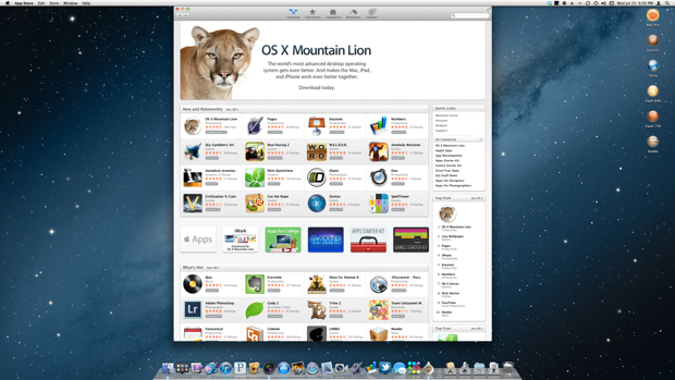
Mountain Lion hit the App Store while I was at work. I knew it was going to take hours to download, since a million users would all be downloading it at the same time. Eager to upgrade when I got home, I used LogMeIn to connect to my Mac Pro at home and initiate my $20 Mac App Store purchase.

I made my purchase and Mountain Lion started downloading. As I suspected, the download time floated around 4 and 5 hours. As long as it was complete when I got home, I’d be happy. Later on in the day, I logged back in and was happy to see that the download completed and the installer was sitting there waiting for the click of my mouse. I’m glad to see that the Mac App Store didn’t go down.

Since Mountain Lion isn’t available in physical media, it’s a good idea to make one in case a reinstall is needed. I’d hate to have to reinstall Snow Leopard and then upgrade. Double OS installs back-to-back are pretty time consuming. With Lion, I learned the hard way. Once you upgrade, the installer package self-deletes. To make a disk image, you have to download the installer again.
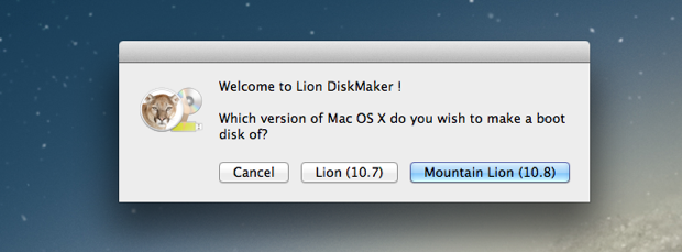
Fool me twice, shame on me. Before I even started the install, I downloaded a copy of Lion DiskMaker and made an image of Mountain Lion.

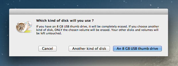
You can burn it to DVD, but they recommend using an SD card or USB drive for the sake of speed. I had done this with Lion and wrote the image to an 8GB SD card. I’ll probably just write over that for Mountain Lion. For now, I’ll just save it to an image and decide later.
I opened up Disk Utility and created an 8GB disk image, mounted it, and pointed Lion DiskMaker to it.

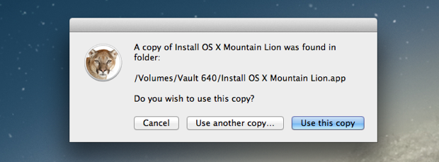
It automatically located the Mountain Lion installer and wrote the files over.

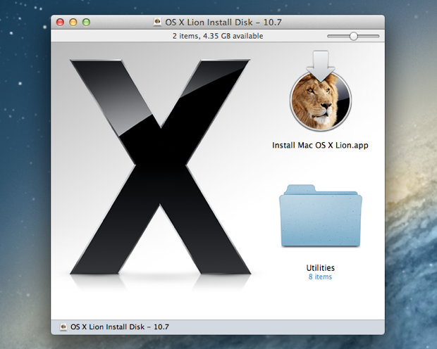
Since I’m most likely going to use the same SD card that currently holds my Lion installer, it probably makes sense to create an image of Lion too, just in case I need it again in the future. Luckily I kept my Lion installer on one of my backup drives because Apple yanked it from the Mac App Store when Mountain Lion went live.
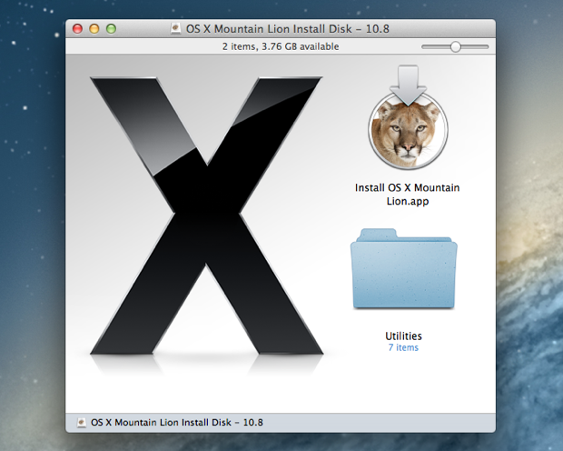
After a few minutes, both of my images were complete and mounted without a problem.


I forced Time Machine to do one last backup, synced my Aperture Vault, and then fired away.
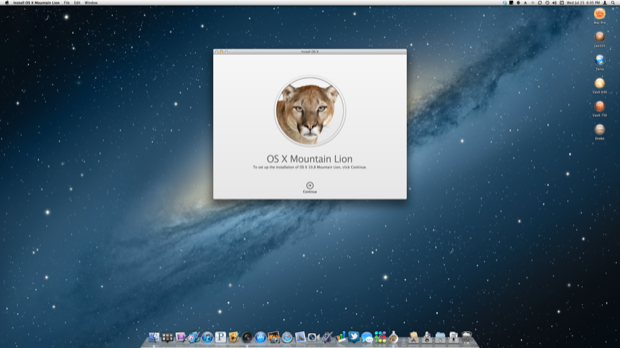
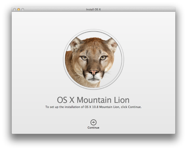
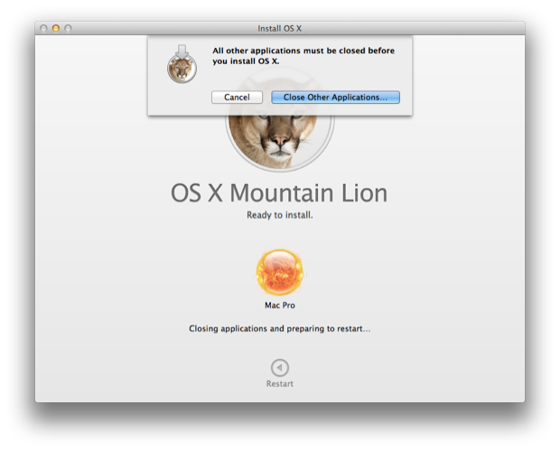
Once the installer was up, I clicked “Continue”.

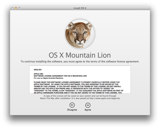
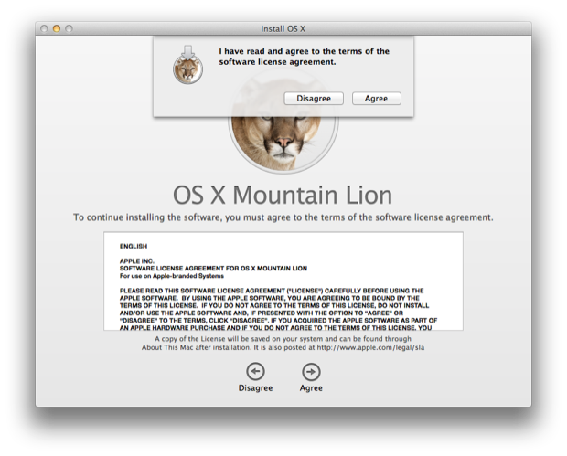
I agreed to the license, as if. Has anyone every disagreed?

Again, does anyone ever read these? Yes, I agree already!

My boot volume was displayed. I clicked “Install” and let Mountain Lion do its thing.

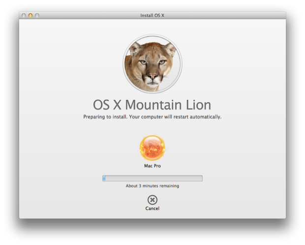
Huh? 3 minutes? Now that’s fast! I read reports online of people with their new-fangled Retina Display MacBooks only taking 14 minutes. I guess my 2008 8-core Mac Pro with 8 Gigs of RAM is no slouch after all!

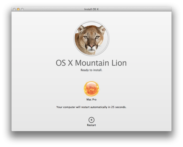
3 minutes past and the installer restarted my Mac Pro.

Oops, I left Aperture open. I had to close that and then click the “Restart” button.

“Your computer is restarting...” Alas, the last screenshot taken in OS 10.7. Lion, we hardly knew yee.

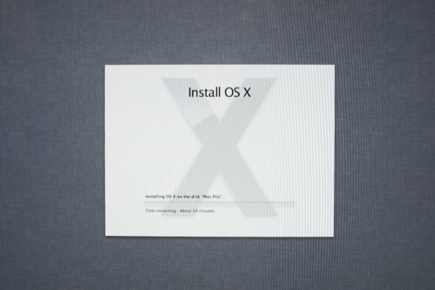
Once my Mac restarted it was clear that the “3 minutes” was just the installer copying the files over. How soon I forgot how the Lion installer did it. Now the real install begins. ETA: 34 minutes. Suddenly, I’m jealous of the Retina Display MacBook users. Then again, It’s twice as fast as some of the iMac and MacBook users who said it took an hour on their newer machines.

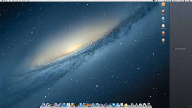
Once Mountain Lion was installed, my Mac Pro rebooted. I logged in and was greeted to a new dock. Ooooh! I think Apple intentionally changes the dock with every OS release just to give you that immediate “it looks new” feeling.

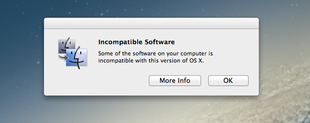
Mountain Lion then displayed an “Incompatible Software” dialog that complained about my apps that were getting left behind.

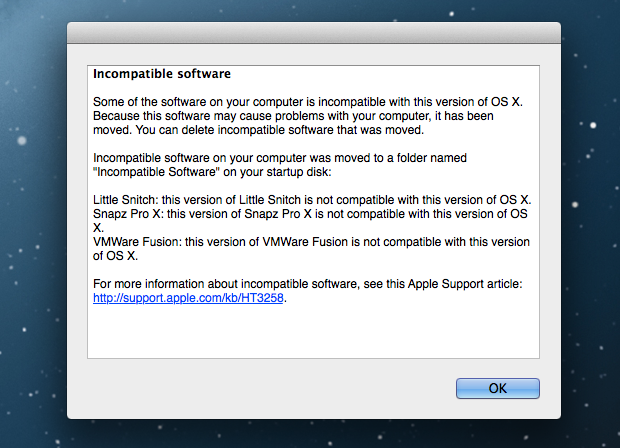
I clicked “More Info”.

Snapz Pro X? No major loss. I didn’t really use Snapz Pro X anyway. I have other screen capture tools that do a better job.
VMWare? Haven’t used that in years. I didn’t work on Lion either. I really need to just uninstall that. Little Snitch? Same, don’t think I was really using it anyway. In Gatekeeper we trust!
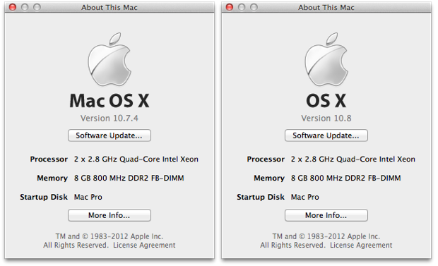
I hit up the “About This Mac” screen to take a screenshot. (It’s sort of a tradition of mine to take a screenshot of every OS version I’ve run.)
I immediately noticed that they removed “Mac” from the title.

OK, let’s dig around and check out the new features. I’m not going to go nuts here because it’s been done to death on other sites already. There’s definitely no shortage of walkthroughs and reviews online.
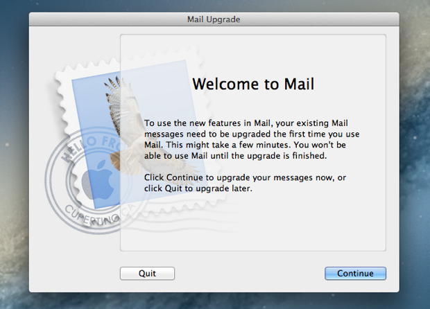
I launched Mail to check out the new VIP feature and was prompted with a “Mail Upgrade” dialog.

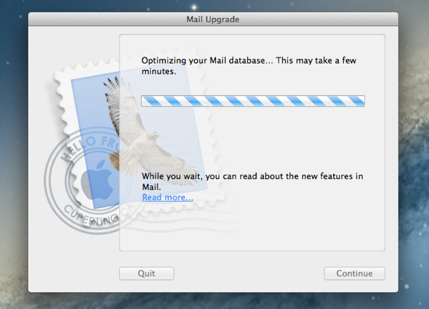
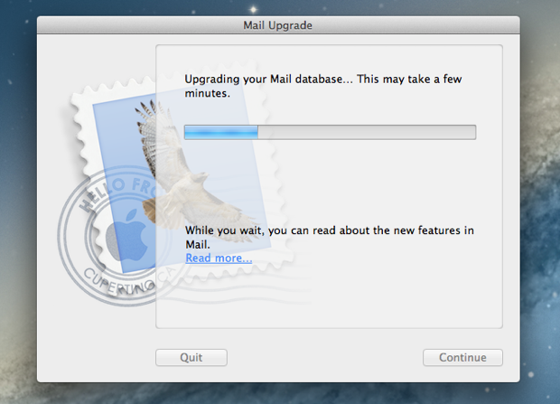
Seems as if Mail needs to do a little housekeeping to get going.


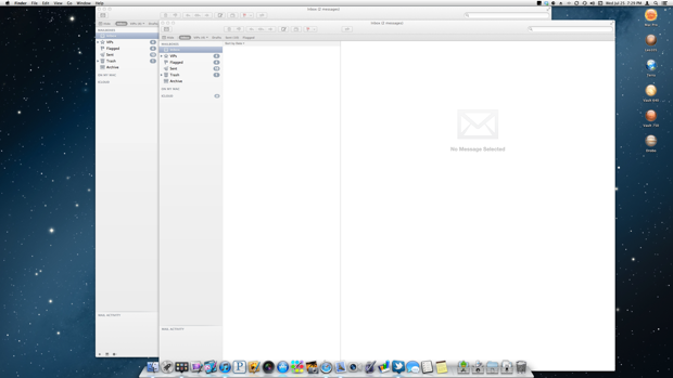
Strange, once it was done I somehow ended up with two Mail windows open. Bug?

The VIP feature is pretty cool. It’s nice to see the Mac version of Mail get some of the features that are in the iOS 6 beta I’ve been testing.
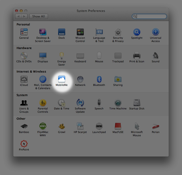
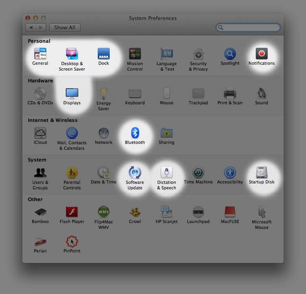
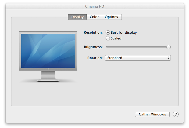
Apple’s attention to detail never ceases to amaze. They even made tiny changes to the icons in System Preferences. From the new “Displays” icon, to the updated dock in “Desktop & Screen Saver”. “MobileMe” is finally gone. “Speech” has been updated to “Dictation & Speech”. They removed the shadows on some of the icons and tweaked the color on others. It is funny that they updated the Display icon to look like the new Thunderbolt display, but it still uses the default wallpaper from 10.4 Tiger. Why didn’t they use the new Mountain Lion galaxy wallpaper?
10.7

10.8

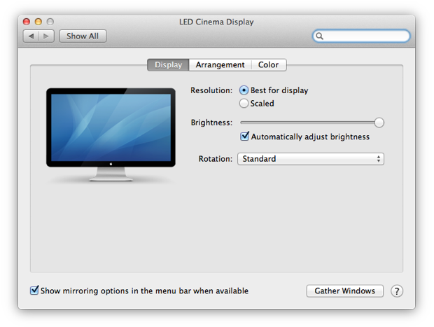
Displays got an overhaul more so than just a new icon. It’s cool how each panel actually knows what monitors you have connected and displays the images accordingly. Again, with the Tiger wallpaper.


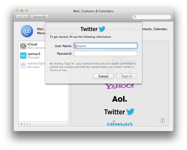
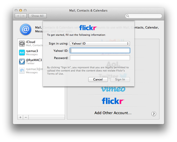
In Mail, Contacts & Calendars, I added my Twitter and Flickr accounts so I can use the many sharing options that are sprinkled throughout the OS.


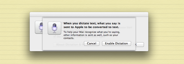
Dictation is new. It should be a pretty handy and fun way to quickly enter text. I tried it a few times for searching in Google and creating test notes. It works pretty well.
I had to enable it the first time I tried it in the new Notes app.


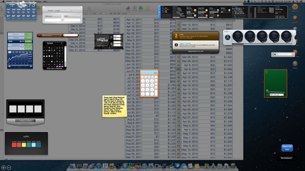
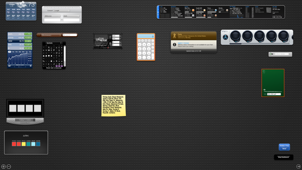
Dashboard had an overhaul. Funny how I just figured out that you can change the behavior of Dashboard back to being an overlay by unchecking the “Show Dashboard as a space” option under Mission Control. I used to hate that Dashboard was in its own space. I loved having it as an overlay from 10.4 to 10.6; especially when you’re trying to use the calculator. When it’s in its own space you have to jump back and forth between the calculator and the app you’re working in, versus just seeing the app right underneath Dashboard. The feature was there all along in Lion, I just never noticed it.
See? As an overlay, it’s so much easier using in the calculator when you can see what you’re working with right under the Dashboard.

Trying to work with the calculator in a different space, you have to keep jumping in and out between Dashboard and the app you’re working with. Annoying!

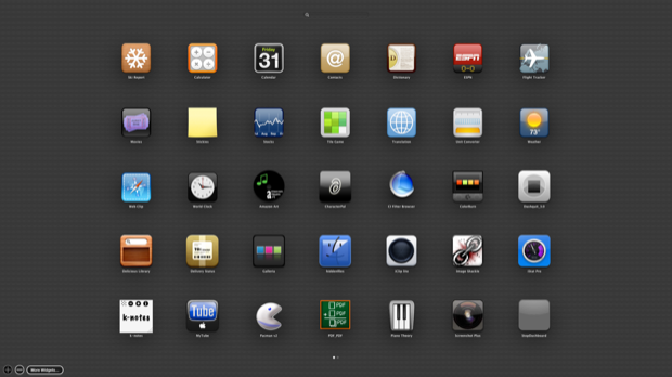
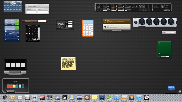
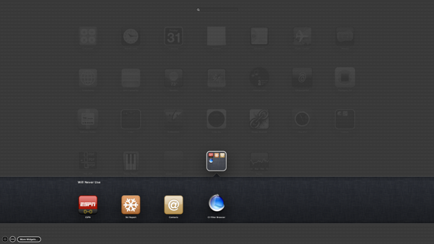
Anyway, they changed the way you add new Widgets. You can now group them together in folders like on iOS.

This is really handy considering the old style had you scrolling along the bottom. If you had a ton of Widgets, it wash’t always easy to find the one you were looking for. I never took a screenshot in Lion, so I edited this one together to illustrate my point.

I like now how I can throw Apple’s Widgets that I’ll never use in a folder and forget about them. (Because they don’t let you delete them.)

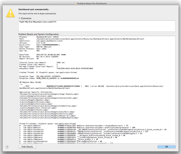
Oh, look at that! My first Mountain Lion crash. Dashboard just flew the coup.

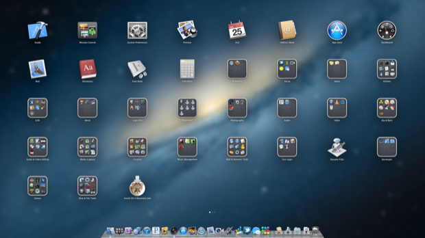
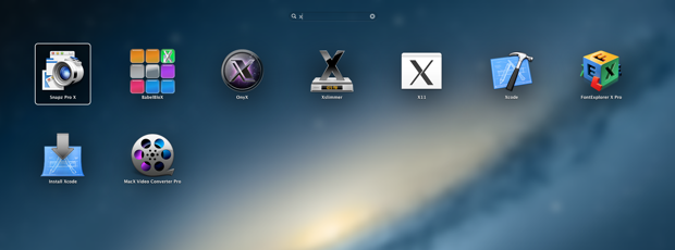
Launchpad might be more useful now that you can actually search for an app. In Lion, your apps were all over the place. It wasn’t sorted in any helpful manner. I tried to group things into folders in an attempt to use as few screens as possible. Not only did I have to remember where the folder was, I had to remember what folder the app was in. Folders made things worse.

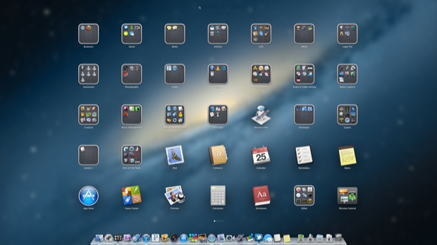
Now the apps or more condensed in the center so you don’t have to look too far left or right to find what you’re looking for. Maybe this isn’t a big deal on a MacBook, but when you’re on a 27” or 30” display, having the whole display filled up with icons is a neck breaker trying to find what you’re looking for.

To quickly find an app, just type in the search field up top. The display of icons filters down as you type.

I know Apple’s all about “bringing it back to the Mac” but some things just don’t translate from the touch world to the non-touch world. At first blush, Launchpad seemed like it was going to be awesome, but in Lion it was a slow and cumbersome task. I found that it was actually quicker to continue launching apps from my Dock Stack.
There were also icons in Launchpad that I’d never use to launch an app. I’d never go into Launchpad to launch Mission Control or Dashboard. I’ve configured the extra buttons on my mouse to launch those. In addition, it’s quicker to just press the dedicated key on the keyboard. I downloaded a third party tool to remove them, as well as some other silly ones.
I thought this time around, Lauchpad would give you a way to just make it a top 10 ten list, or just recently used apps. Anyway, I’m willing to give it another chance. Maybe they got it right this time with the search feature.
One of the features I was most eager to to try out was Notification center. I’m hopeful that it’s going to be a really handy addition. It was a godsend on iOS. Only time will tell if it’s as useful on OS X, or if it’s just eye candy that gets in the way. I’m also curios to see what 3rd party options make their way into the sidebar.

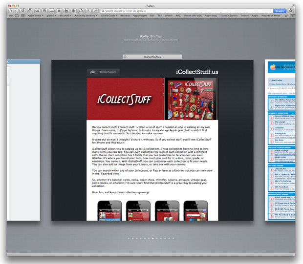
Safari 6 has some great new features. I’m especially digging the iOS-like tab browser. It’s pretty responsive. I was surprised how easily I could scroll through a dozen tabs and continue on a page right where I left off without it trying to reload or refresh. It’s seamless.

As I said before, I’m not going to do a walkthrough of all the new features like Notes and Reminders, etc. I’m just giving my general impression. Mountain Lion is an awesome release. I’m happy with the updates and the full iCloud integration. The OS overall is snappier. I’ve already noticed that Aperture too is a lot more responsive than it used to be, for that I’m thankful. Aperture often reminds me that my 4 year old Mac Pro is growing a little long in the tooth.
Some people are already saying that Mountain Lion is what Lion should have been. That’s arguable. Lion was a great release in its own rite. For a meager $20 it would be an injustice not to upgrade.
Mountain Lion. Go get it.


